1
2
3
4
5
6
7
8
9
10
11
12
13
14
15
16
17
18
19
20
21
22
23
24
25
26
27
28
29
30
31
32
33
34
35
36
37
38
39
40
41
42
43
44
45
46
47
48
49
50
51
52
53
54
55
56
57
| class HYContentBody extends StatelessWidget{
final url = "https://timgsa.baidu.com/timg?image&quality=80&size=b9999_10000&sec=1589191476392&di=c7e1699d62fe37ba74ff92362cc71296&imgtype=0&src=http%3A%2F%2Ffile02.16sucai.com%2Fd%2Ffile%2F2014%2F0829%2Fb871e1addf5f8e96f3b390ece2b2da0d.jpg";
@override
Widget build(BuildContext context) {
return Center(
child: Column(
children: <Widget>[
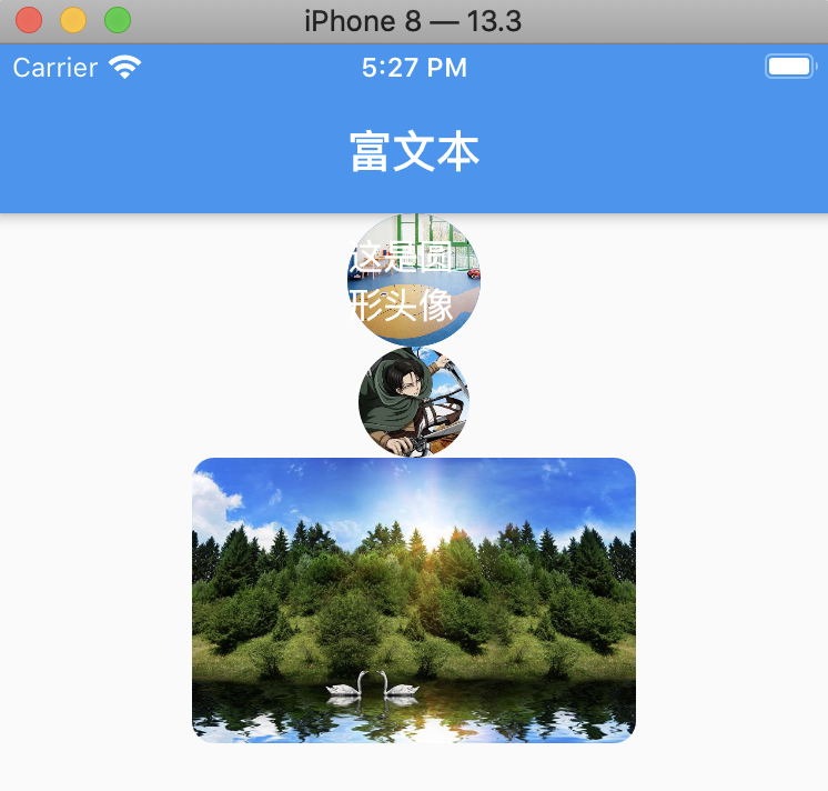
CircleAvatar(
radius: 30,
backgroundImage: NetworkImage("https://timgsa.baidu.com/timg?image&quality=80&size=b9999_10000&sec=1589191476390&di=15174b862ac6db450939ff0637c35ba4&imgtype=0&src=http%3A%2F%2F3732784.s21i-3.faidns.com%2F2%2FABUIABACGAAgxaP3qQUogPOy4QIwywg44AU.jpg"),
child: Text("这是圆形头像"),
),
ClipOval(
child: Image.network(
"https://tva1.sinaimg.cn/large/006y8mN6gy1g7aa03bmfpj3069069mx8.jpg",
width: 50,
height: 50,
)
),
ClipRRect(
borderRadius: BorderRadius.circular(10),
child: Image.network(url,width: 200,),
),
],
)
);
}
}
//通过Image方式,调用网络图片
Image getImage1(url){
return Image(
width: 200,
height: 200,
image: NetworkImage(url),
fit: BoxFit.fitWidth,
);
}
//通过Image方式 调用本地图片
/**
* 1,在项目中创建 assets/images/2.0x 或者 3.0 文件夹
* 2,在pubspec.yaml文件中,开启assets, 注意assets前面的的空格要去掉,与 uses-material-design 同一个级别。
* 3,使用图片
* */
Image getImage2(){
return Image(
//设置颜色以及混入模式
color: Colors.red,
colorBlendMode: BlendMode.difference,
width: 200,
height: 200,
image: AssetImage(
"assets/images/xingkong.jpeg",
)
);
}
|